Kaycomp Machines: Difference between revisions
Jump to navigation
Jump to search
FrankRahman (talk | contribs) |
FrankRahman (talk | contribs) |
||
| Line 20: | Line 20: | ||
| | | | ||
[[File:Kaycomp Final version.jpg|400px]] | [[File:Kaycomp Final version.jpg|400px]] | ||
|| This prototype/production machine appears to match the "Kaycomp" machines/keyboards that have surfaced in the past decade. The monitor has shifted to the left and both vertical floppy drives are now on the right. This was due to minimizing the screens affect on the disk drives and vice-versa. The keyboard case also matches the one that we have seen on later models. The keycaps are all black rather then the | || This prototype/production machine appears to match the "Kaycomp" machines/keyboards that have surfaced in the past decade. The monitor has shifted to the left and both vertical floppy drives are now on the right. This was due to minimizing the screens affect on the disk drives and vice-versa. The keyboard case also matches the one that we have seen on later models. The keycaps are all black rather then the black and blue common in the production machines. This matches machine # but not the Kaycomp keyboard for # This version has the vent holes at the top sides of the case. The contrast knob is on the front. Based on my conversations with Janice and Micheal Batter the colors and font were designed by them. (Interface Age, October 1982) | ||
|} | |} | ||
Revision as of 14:52, 9 June 2025
The prototype evolution of the Kaycomp Machine
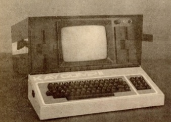
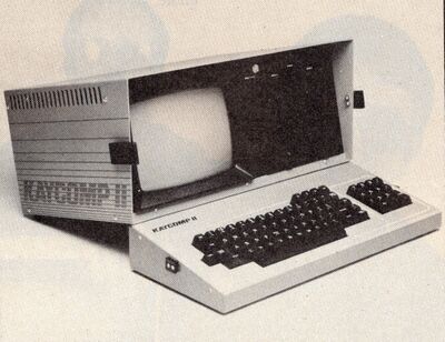
| This prototype is unique in that the keyboard has large lettering of "KAYCOMPII" on it. Also the numeric keypad only has 3 columns of keys where the final design has 4. Likely the keyboard was non-functional since some later versions have an obvious ribbon cable connection and this one does not. The contrast knob and reset button appear to be in the upper right corner. (Electronic Engineering Times, March 15, 1982) | |
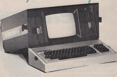
| This version also doesn't have a ribbon cable and uses the 3 column numeric keypad. There are 5 screws on the side of the keyboard so the keyboard is likely made of more than 2 pieces of sheet metal. There appears to be screws coming through the top to connect the keyboard to it's case. (Computer Merchandising Magazine, unknown date) | |
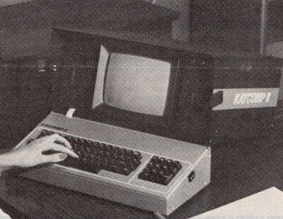
| This prototype may just be a keyboard upgrade. There is a ribbon cable connecting the keyboard to the machine. The ribbon cable appears to just slip through the keyboard case parts and not have any cutouts. The keys appear to match the latter models including a 4 column numeric keyboard. (Industrial Research Magazine, unknown date) | |
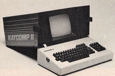
| We finally find the common "Kaypro" style Racing Stripes. Based on my discussions with Andrew Kay I believe he and Henry Hester had a major part in the design of this case. The vent holes that we are used to in latter models do not appear in this marketing photograph. (Desktop Computing, Aug 1982) | |
| This prototype/production machine appears to match the "Kaycomp" machines/keyboards that have surfaced in the past decade. The monitor has shifted to the left and both vertical floppy drives are now on the right. This was due to minimizing the screens affect on the disk drives and vice-versa. The keyboard case also matches the one that we have seen on later models. The keycaps are all black rather then the black and blue common in the production machines. This matches machine # but not the Kaycomp keyboard for # This version has the vent holes at the top sides of the case. The contrast knob is on the front. Based on my conversations with Janice and Micheal Batter the colors and font were designed by them. (Interface Age, October 1982) |
Example machines that have surfaced
Both a Kaycomp Keyboard and Shell #2767
Kaycomp Shell #2749
Kaycomp Keyboard #43168
